Strategic creative AND Creative strategist
During my time at albelli, I wore two hats. I worked as a head of creative, responsible for the creative output and brand guardianship.
I also developed my strategic skills by leading two rebrands and regular TVC creation.
I supported numerous strategic business initiatives, such as new product introductions and actively participated in the quarterly marketing calendar planning.
I also developed my strategic skills by leading two rebrands and regular TVC creation.
I supported numerous strategic business initiatives, such as new product introductions and actively participated in the quarterly marketing calendar planning.
My Role: Brand strategy, Creative Direction
Branding agency: VBAT (NL)
Design & copy: albelli
Branding agency: VBAT (NL)
Design & copy: albelli
Is it always the more, the merrier better?
We are the sum of local players as opposed to a recognised European player. Each brand/vendor had its own visual identity, market stage of growth, brand awareness and business strategy. Every acquisition generated questions about visual identity, recognition, efficiencies, growth...
In a new visual identity and brand architecture, we trust.
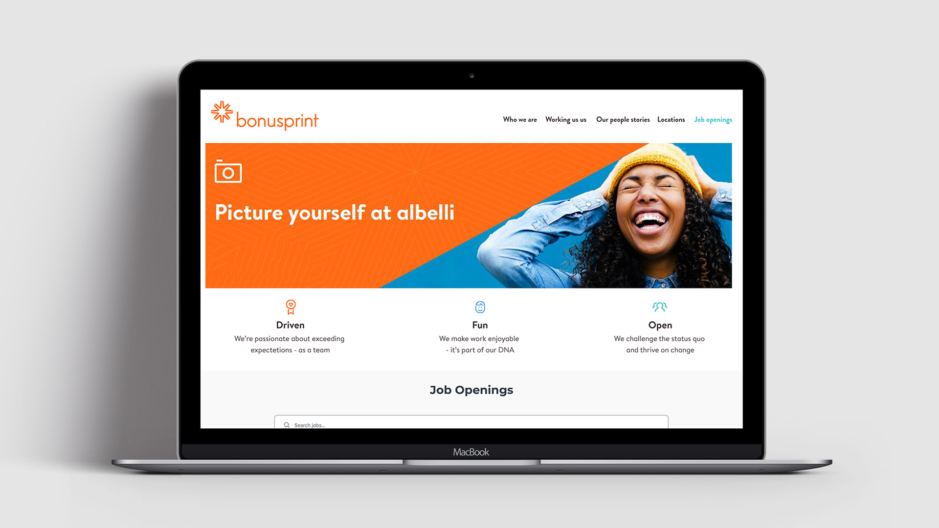
We turned to VBAT, a leading branding agency in Amsterdam, to develop a Pan-EU brand identity to unify all B2C Albumprinter (albelli BV) brands under one unique visual language and successfully implement this identity across all brand touchpoints and channels.
New look. New logo. Same great quality.
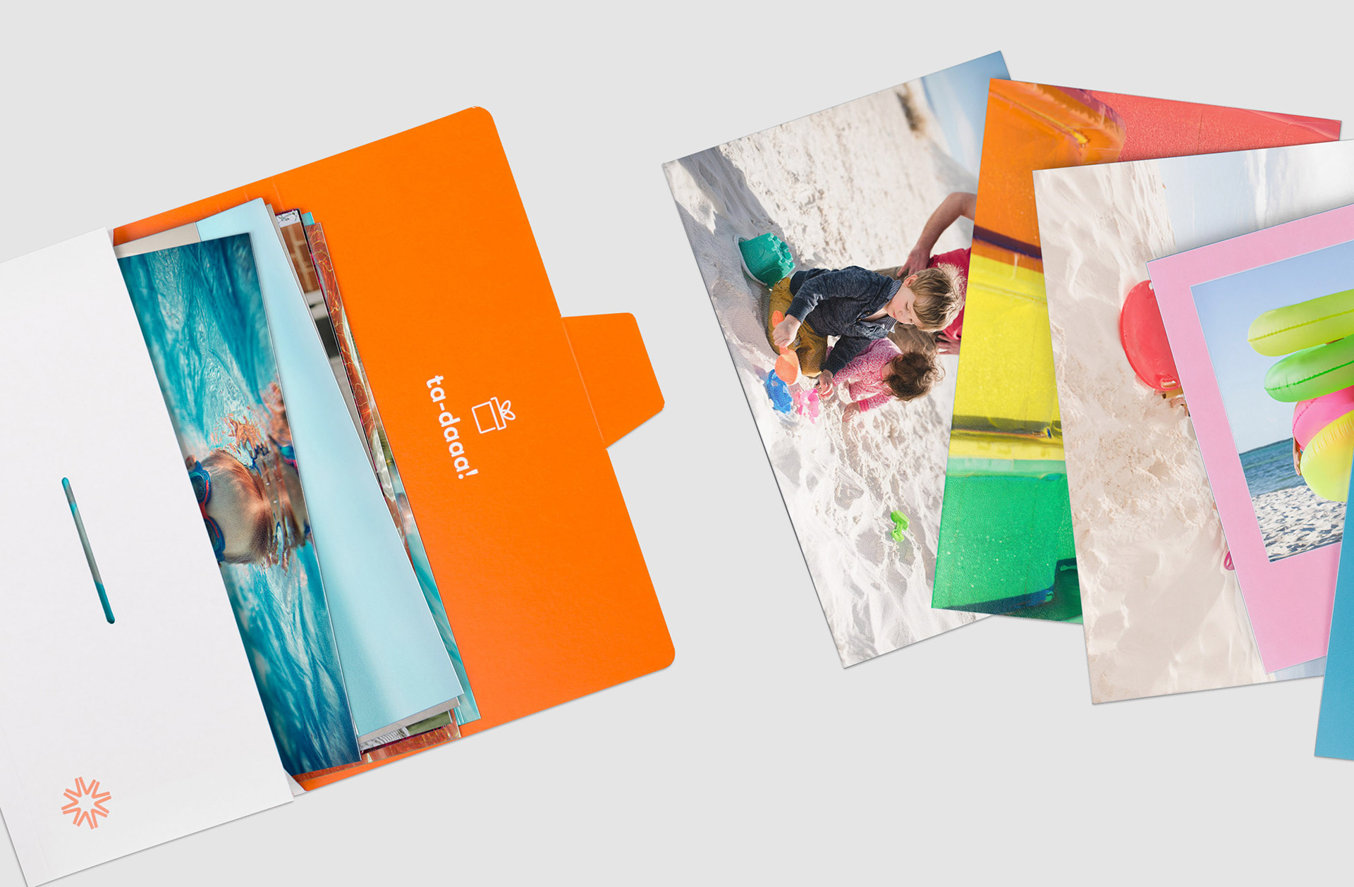
We have a new look and a new look logo, but we’re still the same at heart, offering the same great quality. To rebrand, we prefer brand evolution. The new identity was launched in October 2016 alongside our new mission statement, "To brighten up the world by bringing people’s moments to life'.
It was essential for us to freshen up our look and feel and visually reflect our company vision of brightening up the world by bringing people’s moments to life with an identity that is vibrant, fresh and embodies the personality of our brand (optimistic, positive, adventurous).
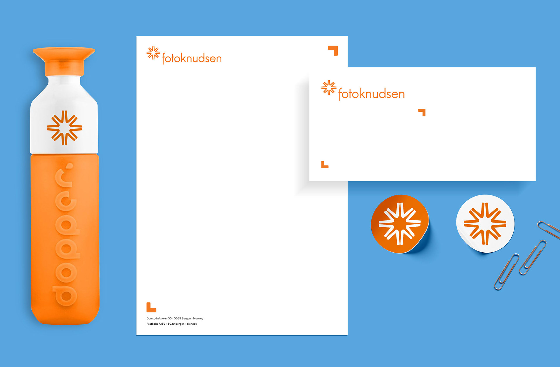
We have simplified and modernised our logo putting more emphasis on the flash. The flash icon symbolises capturing the action and brightening the moment. A photographic icon that's the perfect symbol for our brand.
We’ve developed a colourful and punchy colour palette that conveys the optimism, positivity and passion we all share here at Albelli and, at the same time, brightens up our (and our customers’) world.


Library of icons
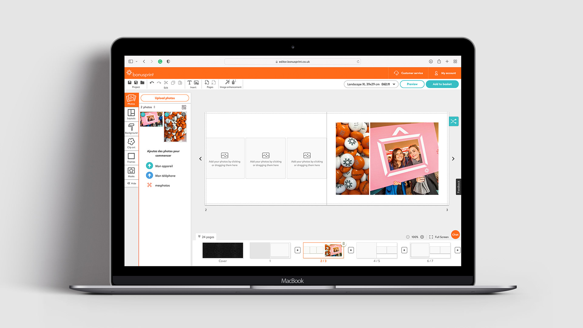
Initially, we introduced icons to represent our product categories. Subsequently, we added icons to identify specific albelli moments such as weddings, births, and celebrations. Lastly, we incorporated custom icons into our editors, including the app, PC/Mac, and online editors.
Playing with brand architecture
We utilized the flash icon from the albelli umbrella identity to create a distinctive shape that endorses the sub-brand for Minnebanken, a cloud storage solution provided by our vendor Fotoknudsen to their customers.

