When the Marmot expands her den.
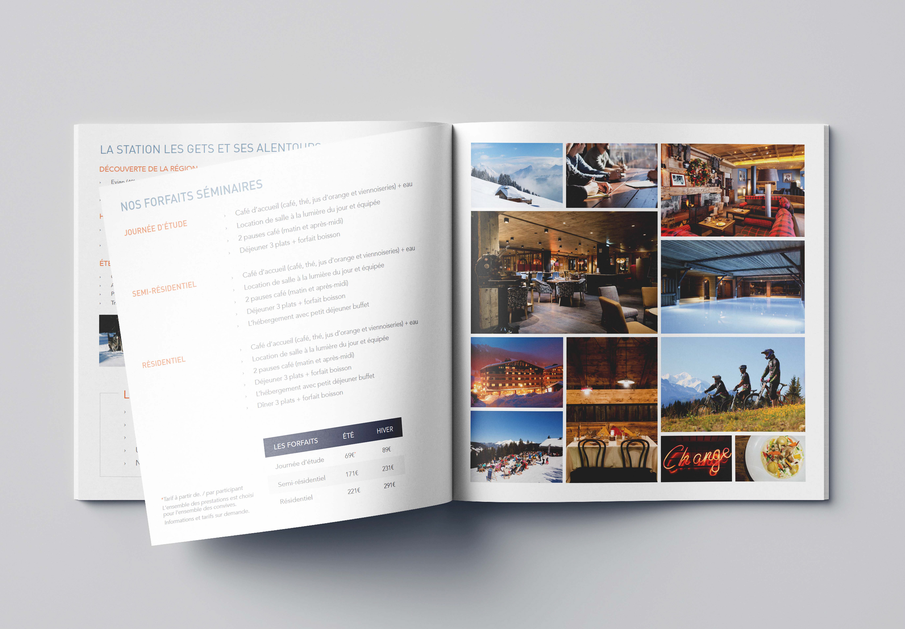
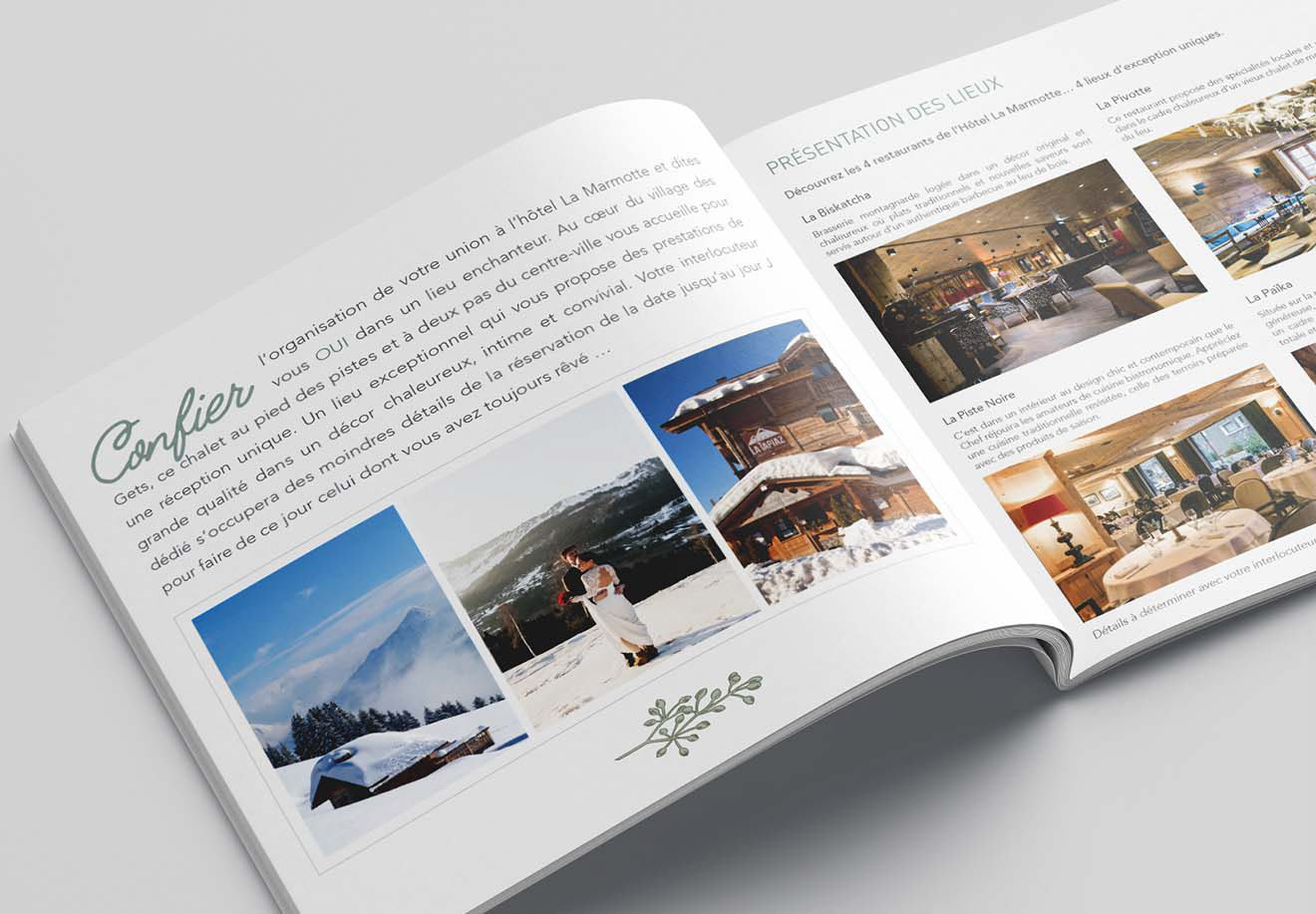
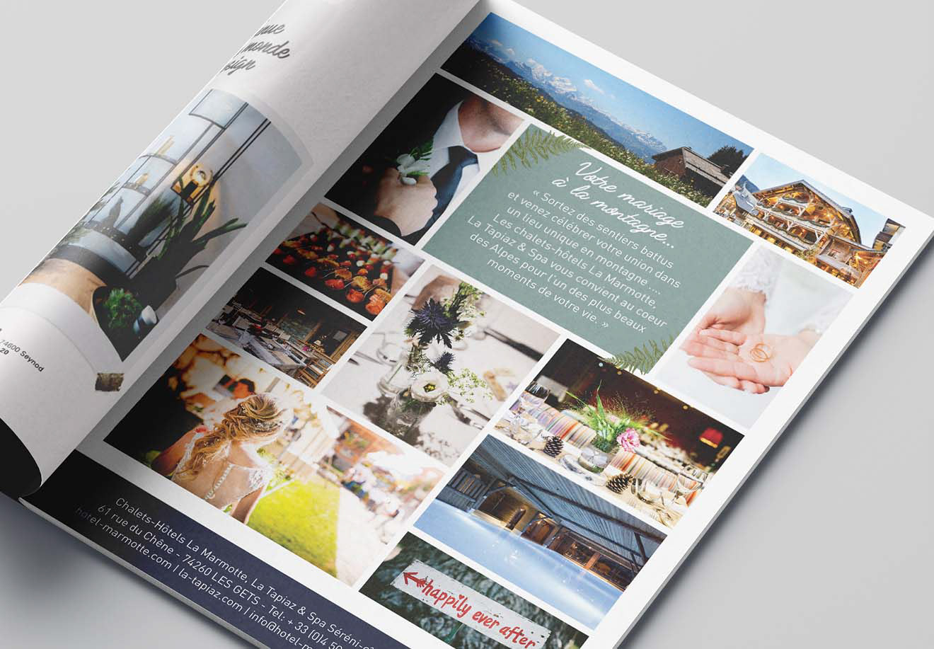
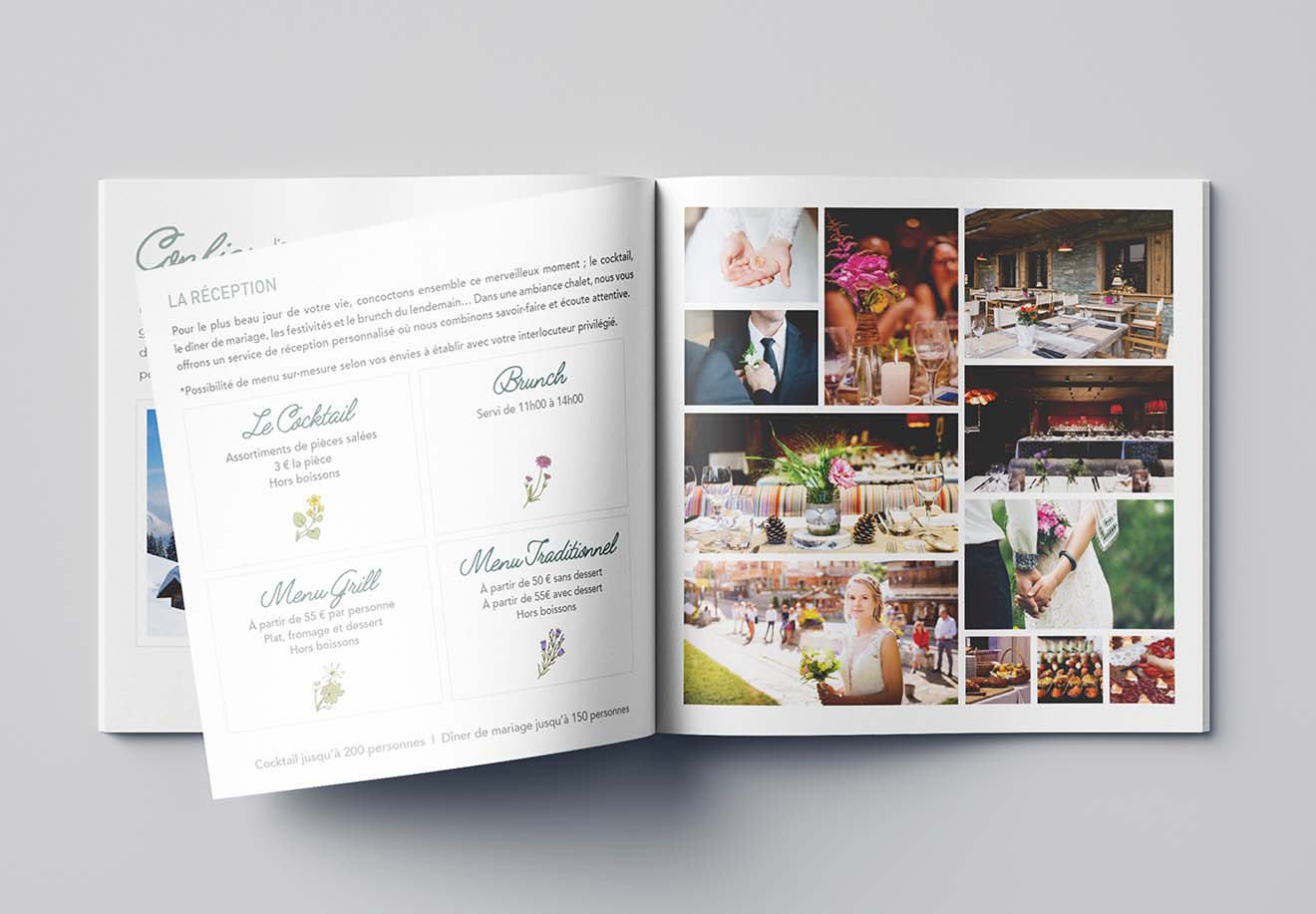
La Marmotte is a family business in Les Gets, Haute-Savoie. Back in 1936, it first opened its doors as a small "salon de the" facing the slopes. Over the decades, the hotel expanded in amenities, locations, and offerings. The hotel has three main buildings with rooms, four restaurants (3 on the premises and one on the slopes) and a spa. Each establishment has its own logo.
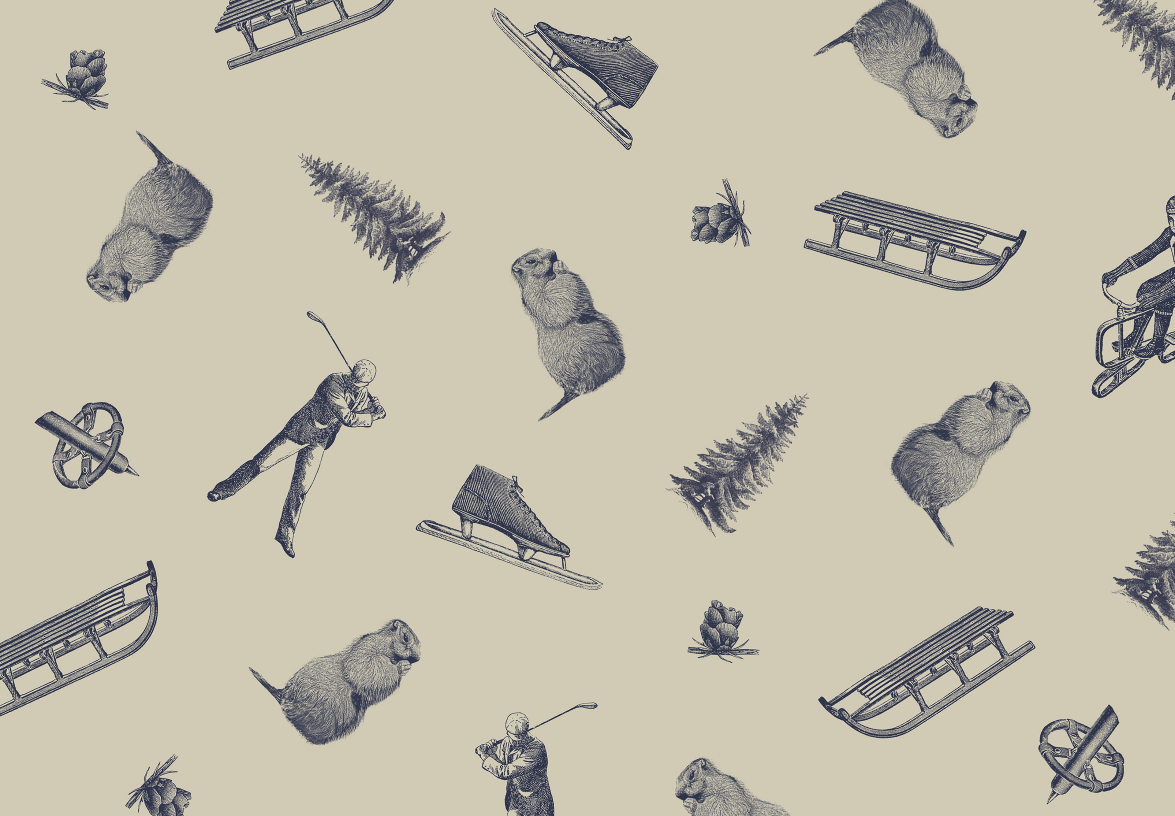
Brief: 1- create an overarching logotype for the family business gathering all activities to use across mediums with or without the single identities. The aim was to simplify the usage of multiple logos and create recognition around the family hospitality savoir-faire. 2- Develop a visual identity reflecting the strong heritage of the brand image while supporting the new umbrella logotype.
Solution: I proposed a dynamic logo that the client could adapt based on their need with one static anchored element. The "M" shape on the left reflects the "M" from the family name Mirigay and the surrounding mountains. The right side of the logo is meant to be dynamic and can be adapted.
Role: Creative & Art Direction, Design
